UK Grid
OnlineBuilt and running now, free for anyone to use.
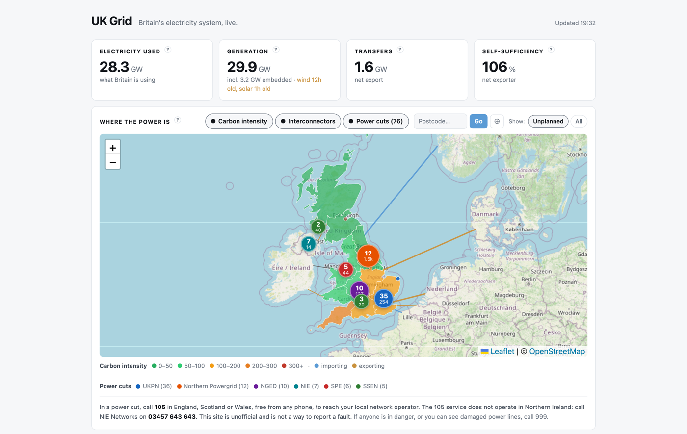
This one started with a much smaller question, and grew until the original question was a single layer on a map. It is a web page that shows what is generating Britain’s electricity right now, how clean it is, what is flowing through the undersea cables that link us to our neighbours, what electricity is trading for on the wholesale market, and where the power is currently out.
It lives at power.ghz599.net. It is unofficial, it is not affiliated with any network operator, with Ofgem or with NESO, and every figure on it comes from a public source. There is a How it works page on the site itself if you want any section explained in detail, and a status page that shows the health of every feed behind it.
Why I built it
It began as a power cut aggregator. The question was the one everybody actually asks when the lights go out, which is whether it is just my street. Britain has fourteen distribution network operators and each publishes its own outage information in its own way, so there is no single place to look. Seven scrapers later I had that single place.
Then it kept going. Once you are collecting from the grid every few minutes it is a short step to asking what is generating the electricity, and then how clean it is, and then whether any of this is unusual compared to last year. Outages became one toggleable layer on a map rather than the whole point. The repository is still called powercut-aggregator, which I have left alone as an honest record of where it came from.
What it shows
Four headline tiles sit at the top: electricity used, generation, transfers and self-sufficiency. Below them is a map with three layers you can switch between, showing carbon intensity shaded by region, live interconnector flows, and current power cuts.
After that comes the detail. The generation mix by fuel type as a share of gross generation. All ten interconnectors, with direction and magnitude. Carbon intensity, actual and forecast, national and regional. The market index price for the current settlement period. A set of five plain-language signals answering questions like whether the grid is stable, whether it is a good time to use electricity, and whether wind is being held back. And a history section covering the past day, week, year and all time.
Saying what the number actually is
This is the part I found genuinely interesting, and it is where most of the effort went.
Grid data is full of figures that look interchangeable and are not. Two sources will both say “demand” and mean different things. A number labelled carbon intensity was never measured at a chimney. An estimate published nine hours ago will sit quite happily next to a meter reading from four minutes ago, and nothing in the presentation tells you which is which.
Early on I asked a blunt question about my own site: are these numbers real? The answer turned into a standing rule. Every figure belongs to exactly one of four classes, and I have to know which before it goes on the page.
| Class | Meaning | Examples on this site |
|---|---|---|
| Measured | A meter reading or an executed trade | Generation by fuel, interconnector flows, grid frequency, wholesale price |
| Estimated | The source models it because no meter exists | Embedded wind and solar, the rooftop generation nobody meters |
| Modelled | Calculated from other figures using assumed factors | Carbon intensity, which is generation mix multiplied by emission factors |
| Derived | My own arithmetic, inheriting the weakest input it uses | Electricity used, self-sufficiency, the interconnector percentages |
A second rule follows from the first, which is never to reuse an official term for a quantity that is not that term.
The example that produced the rule
The headline figure on my page runs about 4 to 5 GW higher than the National Demand that NESO publishes. Measured on one settlement period while I was building it, the gap was 4,888 MW. Just over 4,000 MW of that was embedded generation, and the remaining 886 MW was station load and pumped-storage pumping, both of which NESO’s definition deliberately excludes.
Neither figure is wrong. They answer different questions. To the transmission system, a house running on its own rooftop solar simply looks like less demand, so National Demand does not count it. If what you want to know is how much electricity the country is actually using, then you do.
The fix was not to pick a side. It was to refuse the collision. The headline is labelled “Electricity used” and never bare “Demand”, and the page carries a short section explaining exactly why the two differ and by how much. Had I called mine Demand, the site would have looked five gigawatts wrong to anyone checking it against an official source, and they would have been right to distrust everything else on the page as well.
That is the whole idea in one decision. Apples and pears are fine if you say so, and silently wrong if you do not.
The same discipline shows up in less obvious places. Anything 45 minutes old or more wears its age on the face of the page, which is why the generation tile routinely admits to wind being twelve hours old while solar is one hour old. The NESO embedded wind estimate really is that stale, and I have watched it pass ten, eleven and thirteen hours in a single evening. Carbon intensity is labelled actual or forecast and shows its age, because the actual for a settlement period cannot exist until the period has closed. The page also shows two different wind figures on purpose: the generation mix counts metered plus embedded wind, while the wind signal counts metered alone, because folding a nine-hour-old estimate into a reading that claims to be current would be dishonest. They differ by roughly a gigawatt, and the site says why. Where the evidence runs out, the page says so rather than inventing a number.
Where the numbers come from
Three separate machines, which matters more than it sounds. A VPS runs the seven power cut scrapers on a ten-minute cron, one per network operator, some through a published API and some through a headless browser because that is all that is on offer. A managed Postgres database holds everything. A web host serves the site and runs the grid ingest every five minutes.
The VPS cannot write files that the web server will serve. They are different machines, and the database is the only thing both can see, so it became the meeting point by necessity rather than by design.
The part I like best is that neither machine can detect its own death, so each watches the other. The web host watches the seven scrapers, the VPS watches the grid ingest on the web host, and anything that goes quiet past its threshold raises a notification on my phone. A summary of all eight feeds arrives every morning at eight o’clock whether anything is wrong or not, on the principle that a monitoring system you never hear from is indistinguishable from one that has stopped working.
Readings roll up as they age. Five-minute data is kept about a day and a half, half-hourly for 28 days, then daily, weekly and monthly kept permanently. Six and a half years of British electricity fits in under 4,500 rows, and the daily table currently holds 2,413 of them, covering every calendar day since the end of 2019 with no gaps. One small schema decision I am quietly pleased with: every measurement column is nullable, with no zero defaults. Four of the ten interconnectors did not exist in 2020, and storing them as zero would make a decade-long chart claim they sat idle rather than unbuilt.
What six years shows
Keeping the history turned out to be the most rewarding part, because things you half knew become specific.
Coal ended on 30 September 2024. On its final day Britain’s last coal station averaged 179 MW, against about 1,400 MW on an ordinary day in early 2020. The country that opened the world’s first coal-fired power station in 1882 stopped burning it for electricity after 142 years, and in the data it simply stops.
Nuclear has fallen by more than 40 percent over the same period, from a 2020 average of 5,395 MW to a little over 3,000 MW across the last 90 days, as the ageing advanced gas-cooled reactors retire faster than anything arrives to replace them.
The windiest day in the record is 22 December 2024, when wind averaged 21.69 GW across the whole day, which is more than Britain’s entire demand on a mild summer night. The cleanest day was 5 April 2024 at 38.2 grams of CO2 per kWh, and the dirtiest was 24 January 2020 at 341.5, nearly nine times higher. Both of those sit inside the same six years.
My favourite is the price. On 28 June 2020, during lockdown, the wholesale price averaged minus £12.54 per MWh, which is generators paying to keep running because demand had collapsed and it was both sunny and windy. Fourteen months later, on 9 September 2021, the same measure averaged £667.65.
Honesty about the limits
As with anything I build, it is worth being clear about what this is not.
- Embedded generation is an estimate rather than a measurement, and the wind half of it is often many hours old. The site labels it, but it remains the softest number on the page.
- Carbon intensity is modelled, not measured. Over 941 days the forecast and the settled actual differed by an average of 3.7 grams, or 2.9 percent, which is reassuring but not nothing.
- Daily figures in the archive are cut on UTC days rather than UK days, so through British Summer Time a day runs from one in the morning to one in the morning. This is stated on the site. It stays that way because the finer readings behind old daily rows are discarded as the archive ages, so recutting six years of history is not something I could do consistently.
- The frequency chart is settled data and runs about a day behind. The live frequency signal is separate and current.
- Power cut data is the operators’ own. Positions are the approximate centre of an affected area and the customer counts are their estimates, not mine.
- Northern Ireland runs on a separate grid. Its power cuts appear, but it has no carbon intensity region, so it is never shaded on the map.
- Output from individual power stations is deliberately out of scope. The data is free, but the reference layer needed to make it meaningful is permanent maintenance.
- It is unofficial, and it is not a way to report a fault. In a power cut, call 105 in England, Scotland or Wales. Northern Ireland is NIE Networks on 03457 643 643.
A note on how it was built
The same disclosure I made about the propagation dashboard, and the site carries its own version on its About page. The concept, the design direction, the editorial judgement and every decision about what to build are mine. The code was written by Claude Code, Anthropic’s AI coding assistant, through conversation. I have not written a line of it myself.
What I think is actually interesting is that producing the code was not the hard part. The hard part was deciding what each number meant, checking whether the page’s own description of itself was true, and refusing to publish anything I could not defend. A late pass reading the site page by page against the live data produced eleven corrections, and not one of them was a code defect. Every single one was the site describing itself wrongly. That is a lesson I did not expect and will not forget.
With thanks
None of this would exist without data that others make freely available, and all rights in that data stay with the people and organisations who produce it.
- The Carbon Intensity API provides the generation mix, carbon intensity and regional data. It was developed by the National Energy System Operator (NESO) and the University of Oxford, and is licensed under CC BY 4.0.
- Elexon BMRS provides interconnector flows, fuel instantaneous data, grid frequency and wholesale market prices. Contains BMRS data © Elexon Limited copyright and database right 2026.
- Sheffield Solar and PVLive provide the live embedded solar generation estimates. © The University of Sheffield.
- The UK distribution network operators provide the outage data, through the public websites and APIs of UKPN, SSEN, Northern Powergrid, SP Energy Networks, National Grid Electricity Distribution, NIE Networks and Electricity North West. No rights are claimed over third-party outage data.
- The map is built with Leaflet.js, and the tiles are © OpenStreetMap contributors, licensed under ODbL.
It is new, and it will have rough edges I have not found yet. If you spot a number that looks wrong, or a label that claims more than it should, I would genuinely like to know.